Data visualizations
I originally built this app to help both my own household and my graduate classmates think about where we/they might like to make a home after finishing graduate school. This tool is for “recreational” use only. It is not completely scientific (and is, of course, provided without warranty). Directions for use: Move the sliders right or left to indicate the importance (weight) of each characteristic in your utility function and the app will return a list of the counties that maximize that function. It is possible to impose hard cut-offs for some variables. How it works: Behind the scenes, each slider controls a parameter in a simple linear utility function. The variables are first transformed into Z-scores, to put them in (somewhat) comparable units. Archive for code/data: Github. Other necessary components: An API key from the Census Bureau.
Notes: Climate security uses county estimates from Hsiang, Solomon, et al. (2017). High school graduation rate data comes from Countyhealthrankings.org, and partially imputed using demographic information from the Census Bureau. Air quality data also comes from Countyhealthrankings.com. Countyhealthrankings.com also provides incomplete violent crime data, which I supplemented with data from the FBI's Uniform Crime Reporting. Mild summers and mild winters calculate the highest average monthly maximum temperature in the hottest month (for summers) and lowest average minimum temperature (for winters), which are then each averaged over the last decade in each county. Data comes from NOAA. Distances to MSAs are calculated as distance from county-centroid to MSA-centroid using shape files provided by the Census Bureau. Politics is determined by 2016 vote shares in each county, as reported by the MIT Election Lab. Housing affordability is measured as median monthly housing cost, as reported by the Census Bureau's 5-year American Community Survey. My wife and I (separately) consistently receive recommendations for counties in Oregon, Washington, and Colorado. Sometimes we also get counties in the Great Lakes area or the suburbs of D.C.
I handled technical implementation to produce the animation below, in a joint effort with Joanne Sherrod. It was featured in Fast Company, tweeted by AFT president Randi Weingarten, and shared on Facebook more than 7,000 times. You can find the code on my Github.

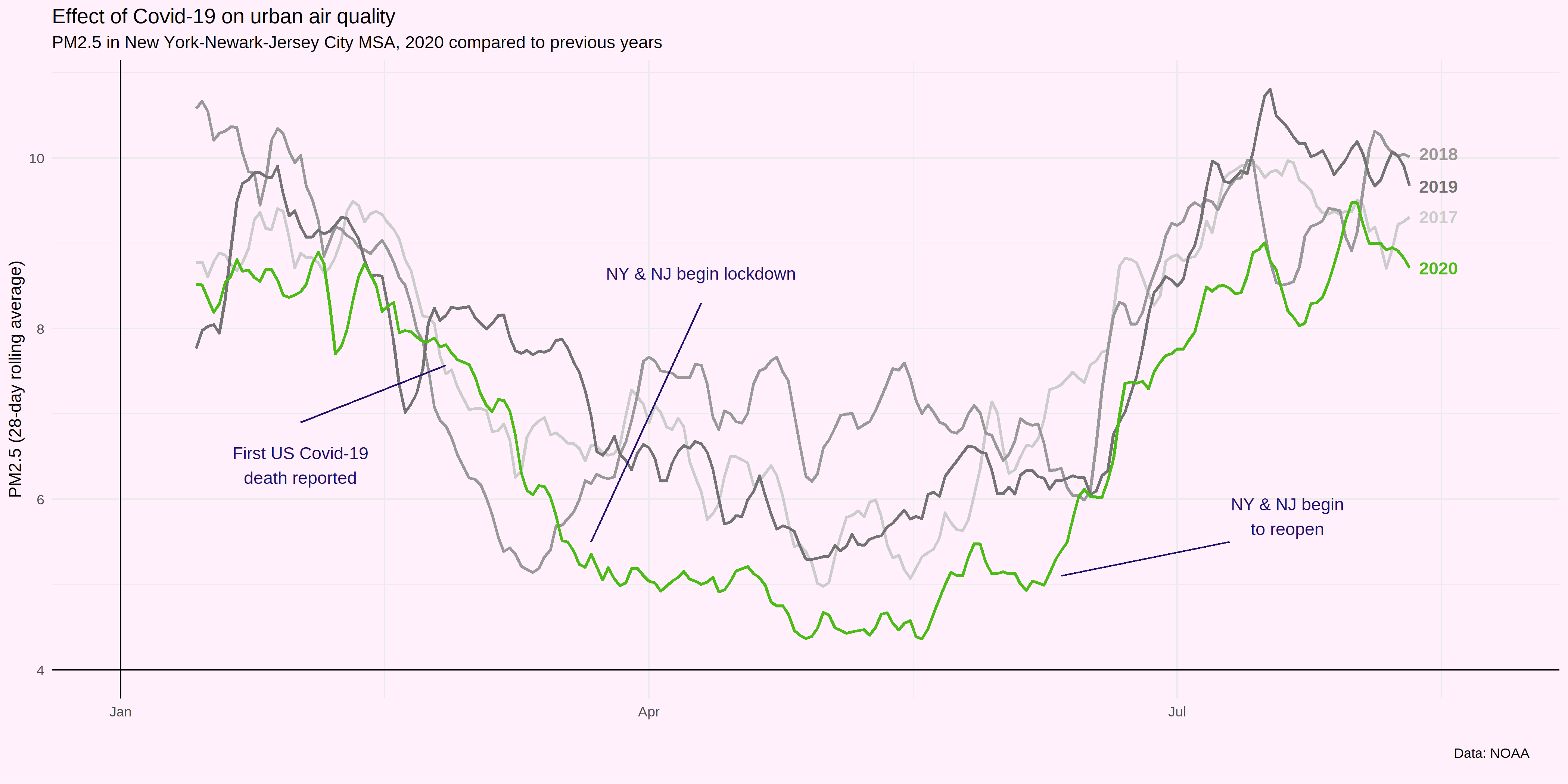
Some recent studies have found significant effects of COVID-19 lockdowns on air quality, especially in cities like Delhi, Rio de Janeiro, and Wuhan. I was curious to see if similar effects were apparent in urban areas in the U.S., so I plotted 2020’s PM2.5 data for New York City, compared to recent years. The effect of the (first) COVID-19 lockdown is visually apparent but smaller than one might hope for. The code and data to produce this plot are on my Github.